최근 웹사이트를 접속하면 색 테마를 유저들이 바로 변경할 수 있는 기능을 제공하는 모습을 많이 본다. 주로 Light 테마, Dark 테마를 선택할 수 있고 특정 버튼을 클릭하면 테마가 바뀐다. 이러한 코드를 직접 작성하면 시간이 오래 걸리고 유지 보수가 까다로운 문제가 발생한다. Material-UI에서는 Theme을 이용하면 이를 쉽게 구현 가능하다. 이를 실습하기 위해 최소한의 기능이 있는 예제를 작성해보았다. 예제는 함수형으로 작성하였다.
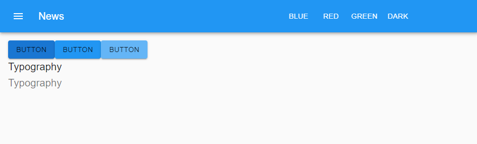

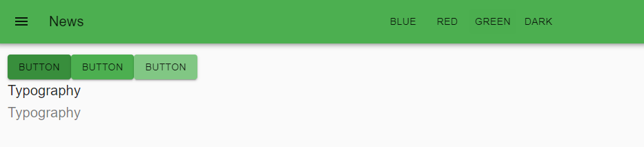

다음과 같이 상단 탭 우측의 BLUE, RED, GREEN, DARK 버튼을 클릭하여 웹 사이트의 전체적인 색 테마를 변경한다. 이를 구현하기 위해 Material-UI의 ThemeProvider, CreateMuiTheme, Palette를 이용하였다.
ColorThemeTutorial.js
/**
 * @author : 이종범
 * @description
 * Material-UI에서 제공하는 createMuiTheme과 ThemeProvider을 이용하여
 * 색의 테마를 자유롭게 바꿀 수 있도록 작성함.
 * 상단의 버튼을 클릭하면 어플리케이션의 전체적인 테마 색이 변경됨.
 * 간결한 코드로 어플리케이션의 테마 색을 변경할 수 있음.
 * @since : 2020.05.1
*/
import React, { useState } from 'react';
import { makeStyles } from '@material-ui/core/styles';
import AppBar from '@material-ui/core/AppBar';
import Toolbar from '@material-ui/core/Toolbar';
import Typography from '@material-ui/core/Typography';
import Button from '@material-ui/core/Button';
import IconButton from '@material-ui/core/IconButton';
import MenuIcon from '@material-ui/icons/Menu';
import { createMuiTheme } from '@material-ui/core/styles';
import { ThemeProvider } from '@material-ui/styles';
import blue from '@material-ui/core/colors/blue';
import red from '@material-ui/core/colors/red';
import green from '@material-ui/core/colors/green';
const ColorThemeTutorial = () => {
  /**
   * @description
   * 상단 메뉴의 버튼을 클릭하며 myTheme이라는 state를 변경함.
   * 이 값에 따라 서로 다른 theme 객체를 ThemeProvider의 props값으로 전달함.
   */
  const useStyles = makeStyles(theme =>
    ({
      root: {
        height: '100%',
        background: theme.palette.background.default
      },
      menuIconButton: {
        marginRight: theme.spacing(2),
      },
      menuTitle: {
        flexGrow: 5,
      },
      menuButton: {
        marginRight: theme.spacing(2),
        flexGrow: 1,
        display: 'flex'
      },
    })
  );
  const blueTheme = createMuiTheme({
    palette: {
      primary: blue,
    },
  });
  const redTheme = createMuiTheme({
    palette: {
      primary: red,
    },
  });
  const greenTheme = createMuiTheme({
    palette: {
      primary: green,
    },
  });
  const darkTheme = createMuiTheme({
    palette: {
      type: 'dark',
      primary: {
        main: '#202020',
      },
    },
  });
  const classes = useStyles();
  const [myTheme, setMyTheme] = useState(blueTheme);
  const handleClick = (e, value) => {
    if (value === 'blue') {
      setMyTheme(blueTheme);
    } else if (value === 'red') {
      setMyTheme(redTheme);
    } else if (value === 'green') {
      setMyTheme(greenTheme);
    }else if (value === 'dark') {
      setMyTheme(darkTheme);
    }
  }
  return (
    <ThemeProvider theme={myTheme}>
      <div className={classes.root}>
        <AppBar position="static">
          <Toolbar>
            <IconButton edge="start" className={classes.menuIconButton} color="inherit">
              <MenuIcon />
            </IconButton>
            <Typography variant="h6" className={classes.menuTitle}>
              News
          </Typography>
            <div className={classes.menuButton}>
              <Button color="inherit" onClick={(e) => { handleClick(e, 'blue') }}>Blue</Button>
              <Button color="inherit" onClick={(e) => { handleClick(e, 'red') }}>Red</Button>
              <Button color="inherit" onClick={(e) => { handleClick(e, 'green') }}>Green</Button>
              <Button color="inherit" onClick={(e) => { handleClick(e, 'dark') }}>Dark</Button>
            </div>
          </Toolbar>
        </AppBar>
        <ColorThemeTutorialContent />
      </div>
    </ThemeProvider>
  );
}

const ColorThemeTutorialContent = () => {
    /**
   * @description
   * 부모 component에서 결정한 theme 객체에 따라 서로 다른 색을 가지도록 작성함.
   * 이때 색을 theme객체의 값을 이용하여 설정하였기 떄문에 theme 객체가 바뀐다고해도 코드를 수정할 필요가 없음.
   */
  const useStyles = makeStyles((theme) =>
    ({
      root: {
        height: '100%',
        background: theme.palette.background.default,
        padding: theme.spacing(2)
      },
      contentButtonMain: {
        background: theme.palette.primary.main,
        color: theme.palette.text.primary
      },
      contentButtonDark: {
        background: theme.palette.primary.dark,
        color: theme.palette.text.primary
      },
      contentButtonLight: {
        background: theme.palette.primary.light,
        color: theme.palette.text.primary
      },
      contentTitle1: {
        color: theme.palette.text.primary
      },
      contentTitle2: {
        color: theme.palette.text.secondary
      }
    }),
  );
  const classes = useStyles();
  return (
    <div className={classes.root}>
      <Button className={classes.contentButtonDark} variant="contained">Button</Button>
      <Button className={classes.contentButtonMain} variant="contained">Button</Button>
      <Button className={classes.contentButtonLight} variant="contained">Button</Button>
      <Typography variant="h6" className={classes.contentTitle1}>Typography</Typography>
      <Typography variant="h6" className={classes.contentTitle2}>Typography</Typography>
    </div>
  )
}

export default ColorThemeTutorial;
ThemeProvider
ColorThemeTutorial라는 컴포넌트를 작성하였고 이 컴포넌트가 부모 컴포넌트가 되고 ColorThemeTutorialContent 자식 컴포넌트가 된다. 부모 컴포넌트와 자식 컴포넌트를 나눈 이유는 material-ui의 ThemeProvider라는 컴포넌트를 사용하기 때문이다. ThemeProvider에 theme 객체를 theme 속성으로 전달하면 추가 작업 없이 이 theme 객체를 모든 자식 컴포넌트에서 사용할 수 있다. 따라서 주로 root가 되는 컴포넌트에서 ThemeProvider를 사용해야 한다. ColorThemeTutorial 코드를 보면 ThemeProvider가 가장 상위에 위치하고 속성에 theme객체를 전달한다.
https://material-ui.com/styles/api/#themeprovider
API - Material-UI
The API reference of @material-ui/core/styles.
material-ui.com
createMuiTheme
createMuiTheme는 theme 객체를 반환하는 함수이다. material-ui의 모든 컴포넌트는 기본 theme이 적용되어 있다. theme에는 여러 속성이 있는데 그중 하나가 palette이며, palette는 여러 색에 대한 정보를 가지고 있다. 컴포넌트의 색을 theme의 palette으로 정의하면 나중에 palette만 수정해 컴포넌트의 색을 수정할 수 있다. 이때 palette값을 수정하기 위해 createMuiTheme에 인자로 theme 객체를 전달하면 기본 theme값에 새롭게 정의된 속성만 변경된 새로운 theme 객체가 반환된다. 이렇게 반환된 객체를 위에서 설명한 ThemeProvider의 theme 속성에 전달하면 된다.
https://material-ui.com/customization/theming/#createmuitheme-options-args-theme
Theming - Material-UI
Customize Material-UI with your theme. You can change the colors, the typography and much more.
material-ui.com
https://material-ui.com/customization/default-theme/#default-theme
Default Theme - Material-UI
Here's what the theme object looks like with the default values.
material-ui.com
makeStyles
theme도 정의했고 이를 사용할 수 있도록 전달했으니 마지막으로 컴포넌트의 색을 결정할 때 theme의 palette를 이용하도록 작성한다. 이를 위해 makeStyles를 이용한다. makeStyles는 함수를 전달받아 hooks를 반환하는 함수이다. 이 hooks는 객체를 반환하는데 이 객체는 className에 인자로 전달할 값을 속성으로 가지고 있다. 이렇게 코드를 작성하면 hooks를 사용하는 컴포넌트 내에서만 사용하고 다른 컴포넌트에는 영향을 주지 않도록 클래스 이름을 설정할 수 있다.
makeStyles에 인자로 전달하는 함수는 theme 객체를 인자로 받아 객체를 반환한다. 이때 반환하는 객체의 속성을 클래스 이름이라 생각하고 속성 값이 그 클래스 이름에 해당하는 스타일이라 생각하면 이해가 쉽다. 이 스타일을 결정할 때 background, color와 같은 속성을 theme.palette의 값을 이용하여 정하면 된다. 이렇게 작성하면 컴포넌트의 색은 theme의 palette에 따라 결정된다.
https://material-ui.com/styles/api/#makestyles-styles-options-hook
API - Material-UI
The API reference of @material-ui/core/styles.
material-ui.com
결과적으로 상단 우측의 버튼을 클릭하면 handleClick이라는 이벤트가 실행되며 각 버튼에 따라 myTheme이라는 state에 해당하는 theme 객체를 저장한다. state가 변경되면서 다시 렌더링 되며 색 테마를 변경을 확인할 수 있다.
예제 확인
https://jb-material-ui-tutorial.herokuapp.com/
Material UI Tutorial
jb-material-ui-tutorial.herokuapp.com
'개인 개발 프로젝트 > Material-UI 실습' 카테고리의 다른 글
| [Material-UI 실습] 11. Stepper (0) | 2020.02.03 |
|---|---|
| [Material-UI 실습] 10. Icons, Material Icons (0) | 2019.11.14 |
| [Material-UI 실습] 9. Tab, Tabs (0) | 2019.11.02 |
| [Material-UI 실습] 8. Grid (2) (0) | 2019.10.24 |
| [Material-UI 실습] 7. Grid (1) (0) | 2019.10.24 |